We Moved To Florida! First Peek Inside
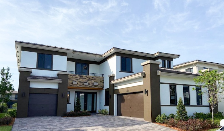
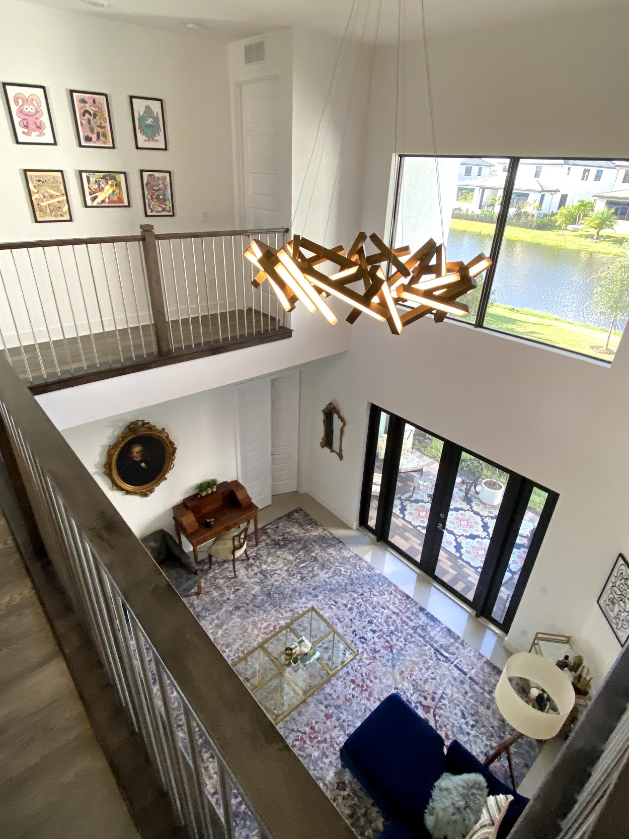
We did it! We finally arrived in Florida and we are mostly unpacked. (There are still a few stray boxes that need to find a home because we have so much less storage here than we did in Boston. Guess we have to build some built-ins again!) Moving was not easy during the whole rona thing, but no one has had anything easy so I’m not complaining! I’ll be sharing our new home in stages because there is too much to do at once. Today, we start with the sitting area! Right as you walk in past the foyer, is a fantastic seating room filled with so much light!
We are far from complete with the décor and it is most likely going to change a lot as we begin more of the design phase with drapery, painting, wallpaper, etc. We are even thinking about doing a feature wall design as well! But today marks a great beginning place so you can see how the space will grow with us in the days to come!
Mixing Modern & Antique Furniture
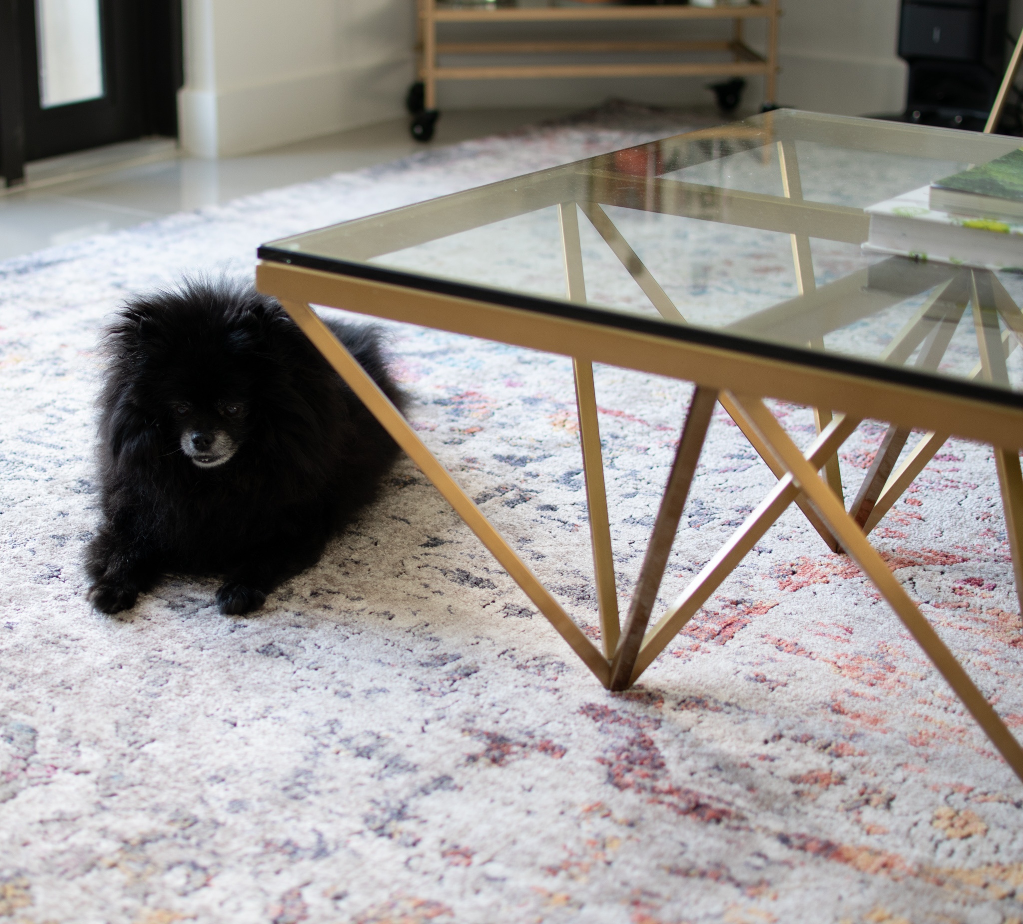
Here’s the thing about our décor, we love modern pieces, but have a ton of antiques that we treasure from Mattycakes’ side of the family. Most of the pieces are a few hundred years old, craftsmanship that you can never find today that are filled with tales of his family from the past. We know the history of each piece that makes it all the more special to enjoy. It took us a while to really settle on how we wanted to enjoy the furniture with our newer favorites, and now that our entire home is modern, we found it most beautiful to mix the eras together. I’ll share a couple tips through this post with how we did it! (PS how cute is our pom Miley on this new rug! She is 14 years old and loves to nap there in the sun)
Different Elements To Balance The Space
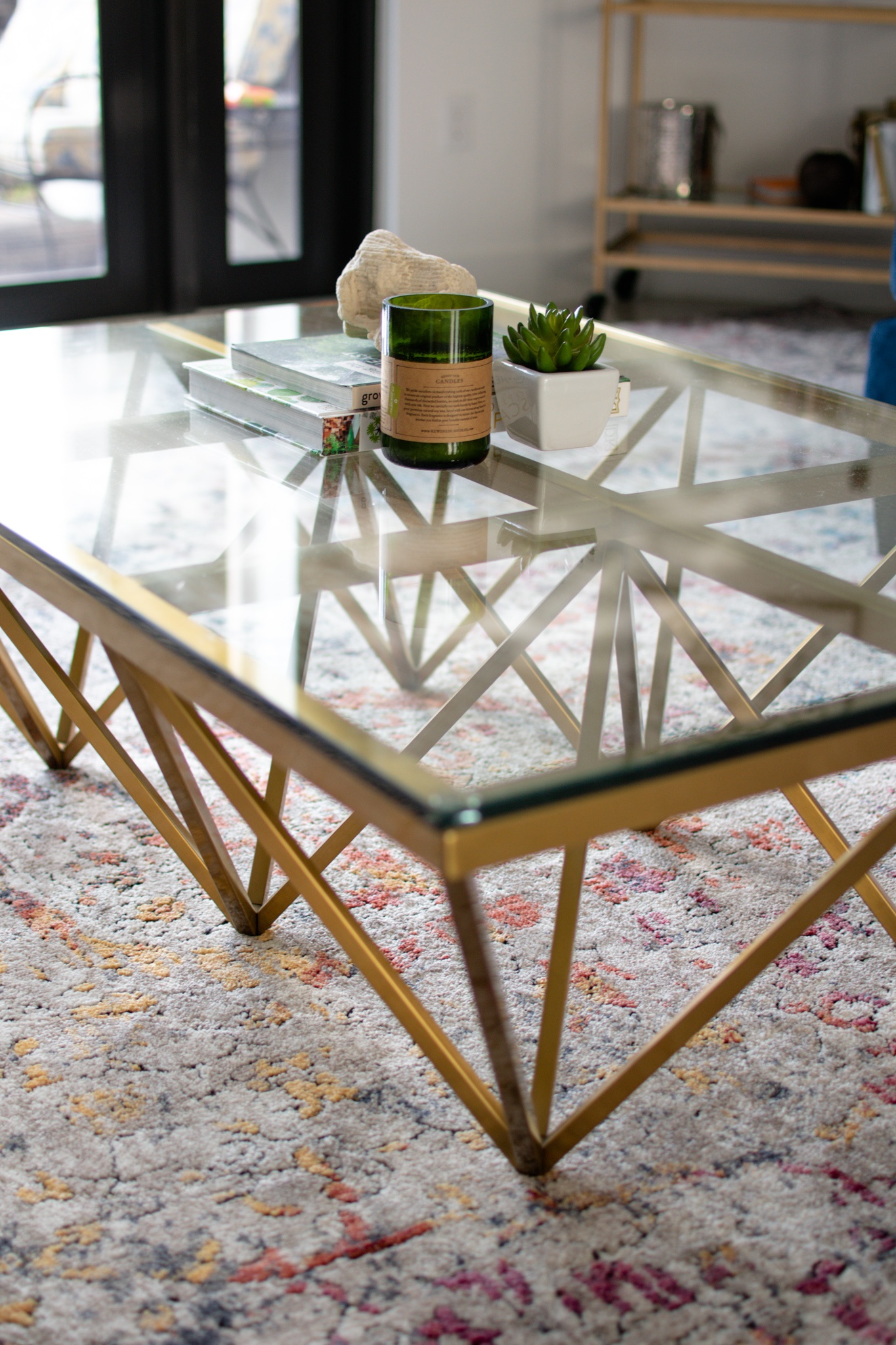
I say this again and again, when in doubt, mix elements! The more variety the better. From metals, woods, leathers, textiles, greenery and more. Even books provide a nice depth.
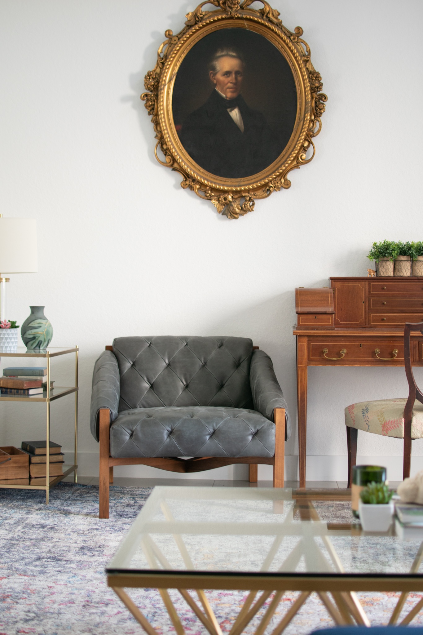
It’s good to mix heavier more masculine items as well with smaller more feminine furniture, which you often find with antiques. This desk is actually Matt’s Great Great Grandmother’s desk (maybe older) we have the “his” version of it as well. We wanted this space to be usable and inviting. It’s a great place to just sit down and get some work done. That way it isn’t just a “pretty sitting room” that no one uses because it doesn’t have a TV (ha).
We balanced the large size of the room and smaller pieces with this larger masculine chair with leather tufts and modern lines. They pair well.
Just above the stately chair is another antique from Matt’s family, John Cannon, who lived in the early 1800s maybe before. This portrait is so old that his great grandmother posed in front of it on her wedding day. The portrait is so large that we said we wanted to give him his own “moment” in this room. So just him on this wall. I’m planning to do a stately wallpaper behind in rich gem tones to further add to John Cannon’s moment.
Modern Lighting
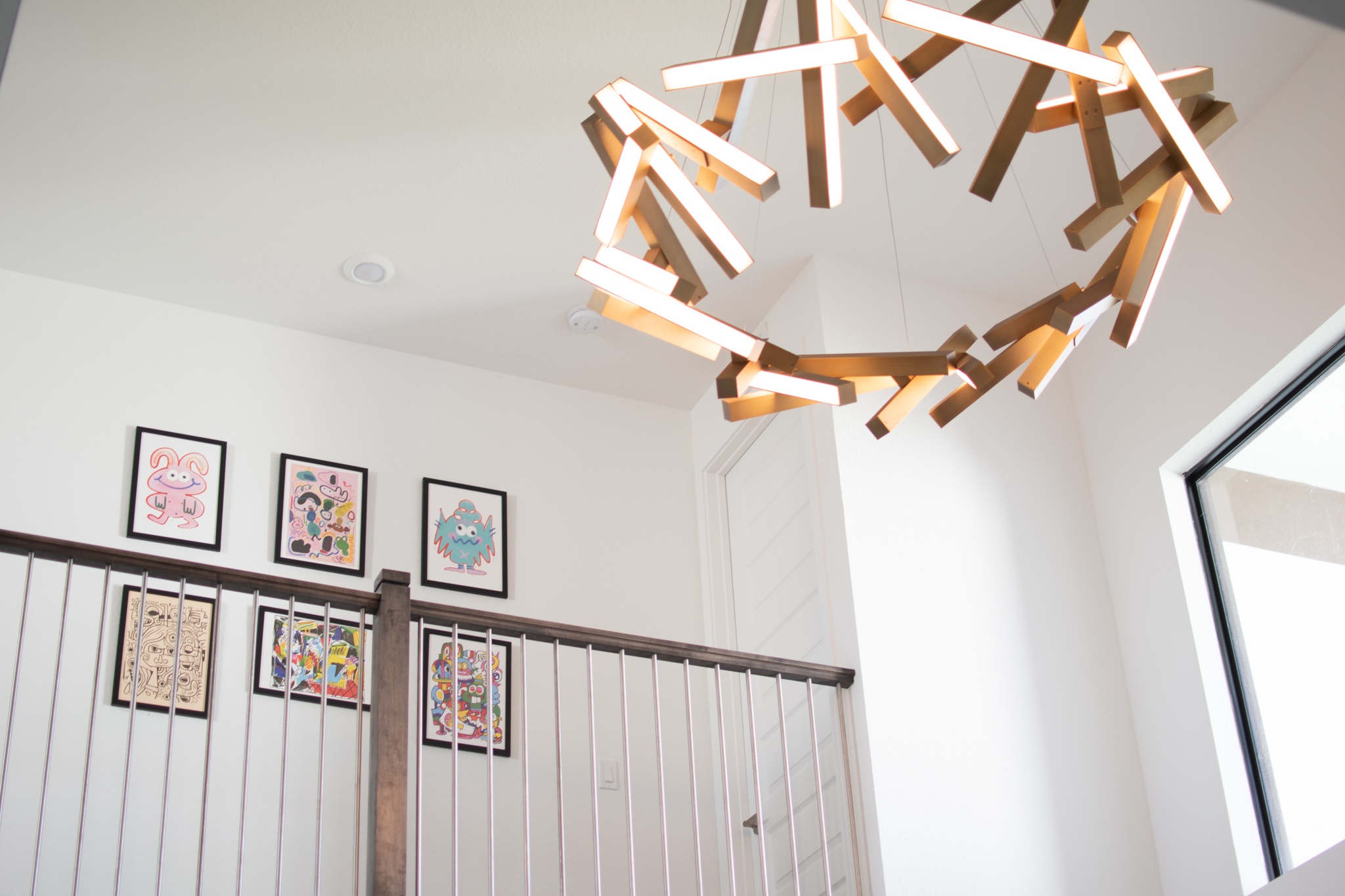
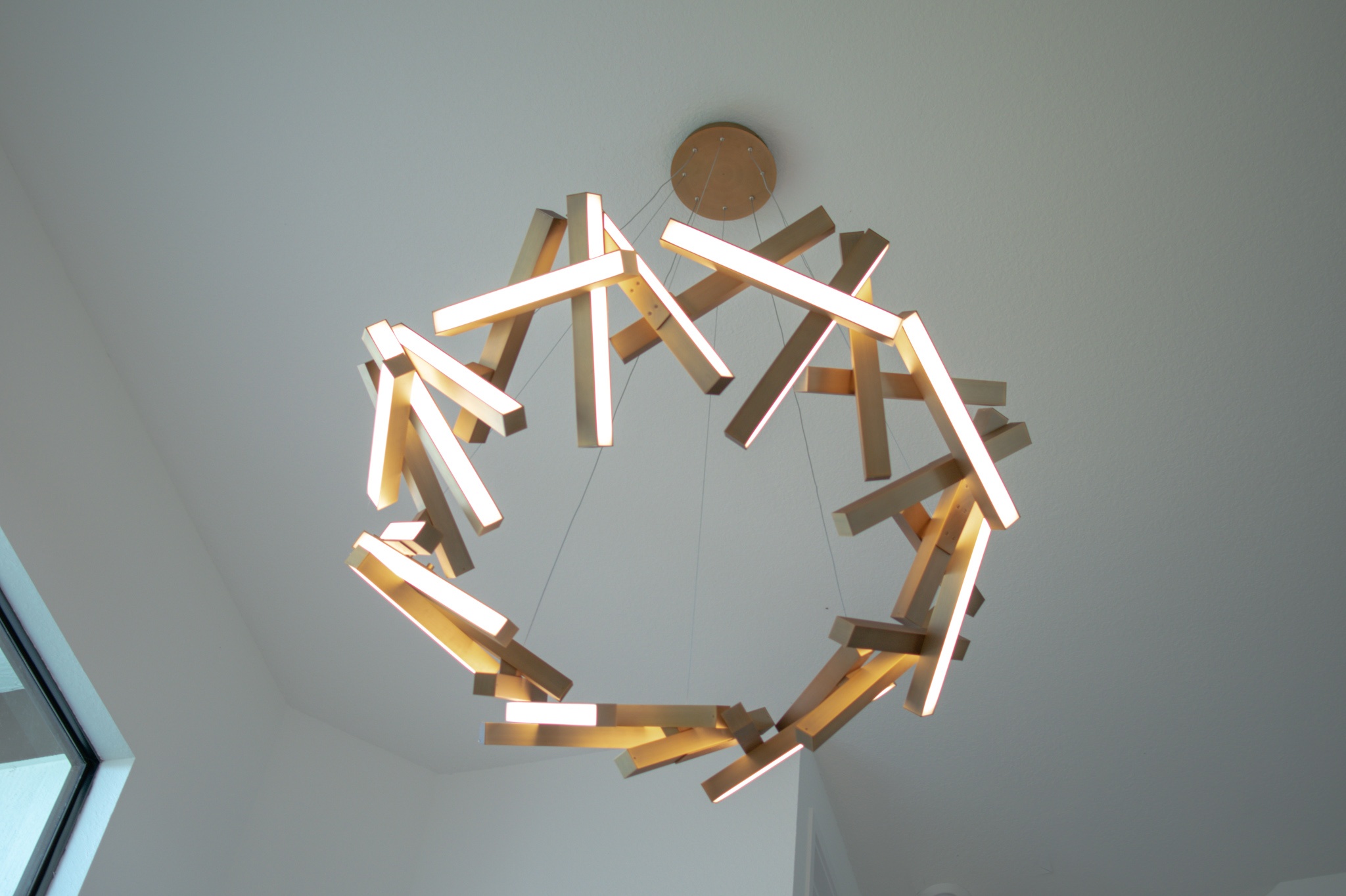
Our absolute favorite in this room! Our new light fixture! The room is two stories tall and surrounded with straight lines. We wanted something grand enough for the space (this fixture is 61″ wide). What we really loved was the warm tones you find inside of the antiques, but also the tones of our newer gold and glass accents in the room such as the tables and bar cart. Plus it’s LED so you’ll never catch me climbing a giant ladder to change a light bulb. Also, this art bridges the walkway between our youngest children’s rooms, it’s a favorite of ours by Jon Burgerman. He is a long time friend and fantastic artist that my husband has worked with for years.
Set For Entertaining
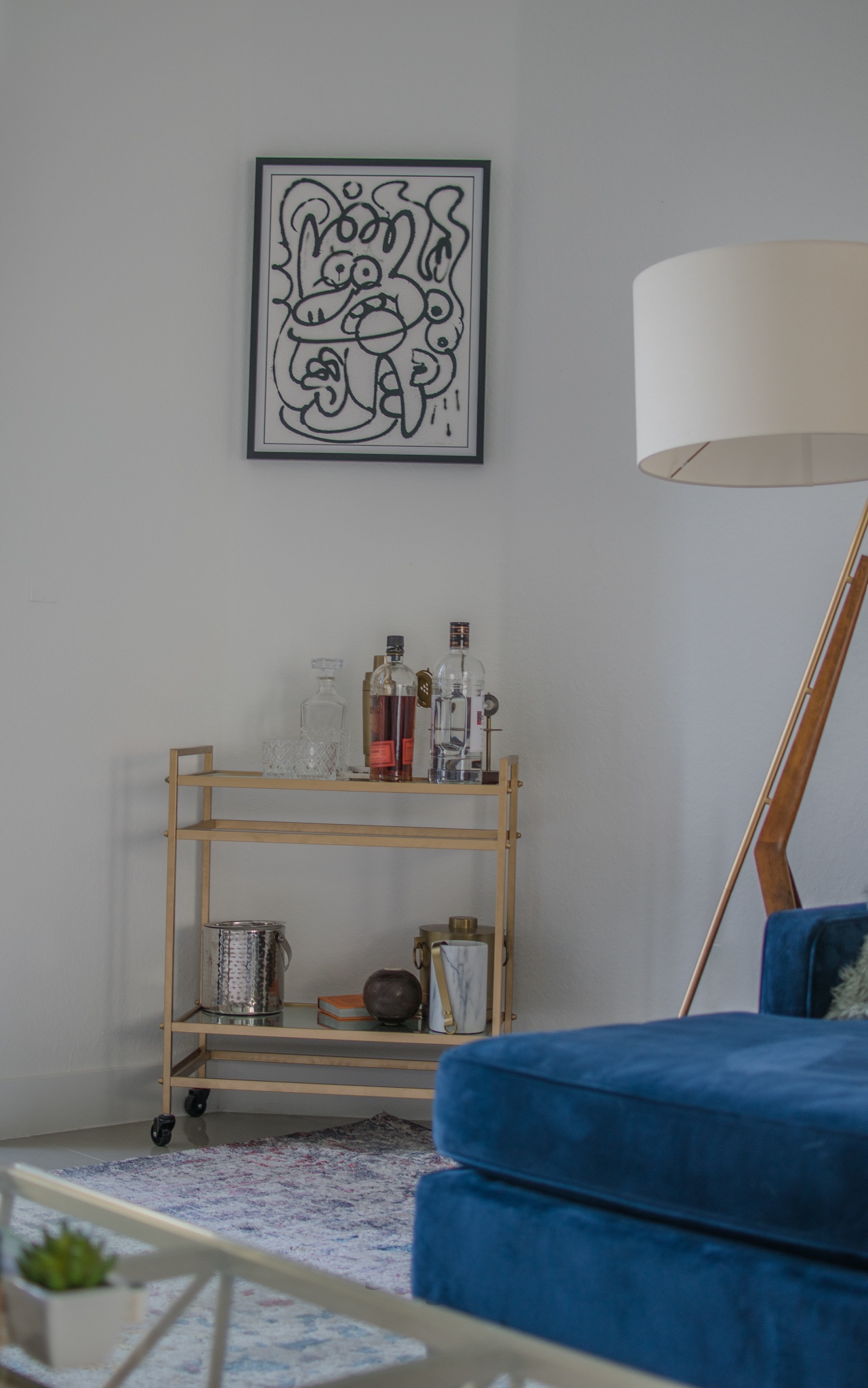
If you followed along in the last house, you’ll remember the blue couch and bar cart! I didn’t take the time to style the cart, oops! I just snapped pictures just the way we live. It’s more realistic this way, you’ve seen everything staged enough on here lol. We do always have it ready to go with spirits, glassware, accessories and more.
It’s another part of us wanting a usable room, where we can gather with company (after this rona thing) and someone can grab a cocktail while still joining in on the conversation. And yes! That’s Jon Burgerman on the wall again, an original in black and white!
One more detail about the accessories on the cart, they’re all marble, glass, brass, and have stitched leather tabs. A masculine feature to a soft dainty cart. It also has an antique Bocce ball with my husband’s initials on it. More photos soon, promise!
Bright Colors
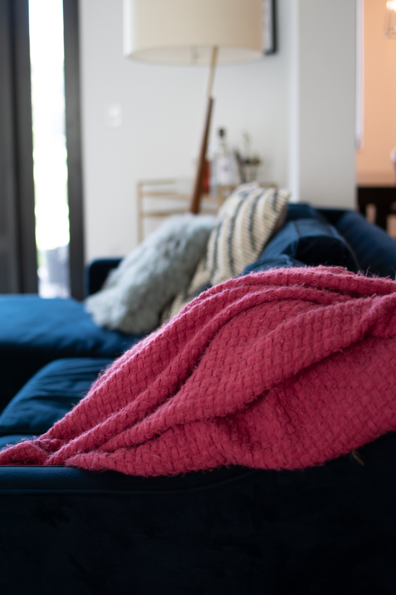
Another piece we brought along from our last house, this couch and blanket loved this space! I used to be so terrified of color, but once my husband and I saw the sofa, well, it was the first time we agreed on something so quickly. After that everything fell together. Now, I wouldn’t buy another boring grey couch again. Even budget pieces, like I’ll show you soon in my kids’ rooms, scream upscale when in colored fabrics.
Happy Accidents
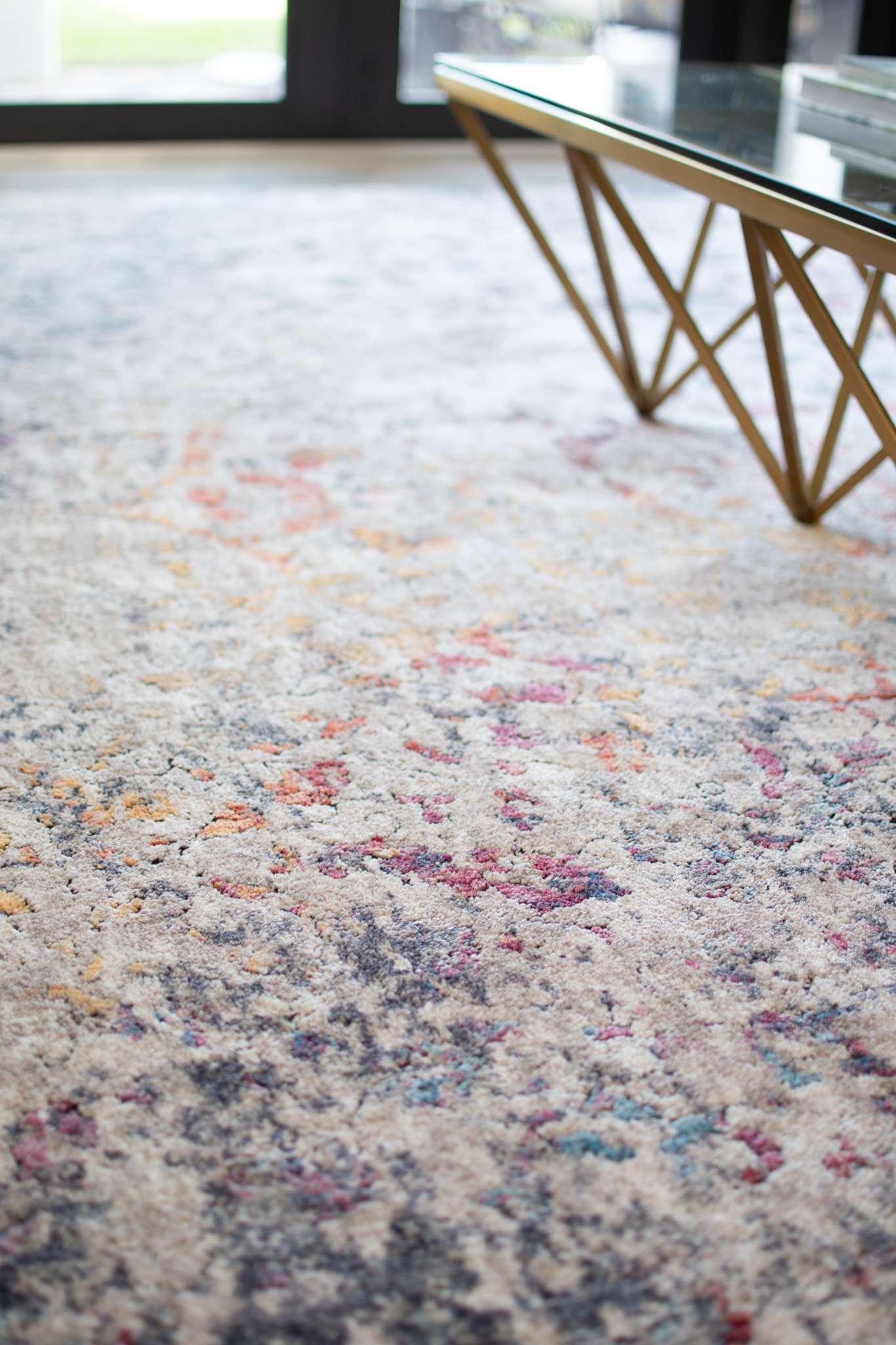
Rugs and lighting tie for me in the ranks of what define a space. They make or break it. They create a space or serve as a backdrop for other items to sparkle. One thing my Husband is notorious for is ordering spectacular rugs- gorgeous rugs! But always the wrong size. Do you hear me giggling? One time he ordered a breathtaking blush powdered rug to sit pleasantly with the blue couch. It came in so small that my coffee table basically ate it sitting on top. That blush rug sits in the foyer now, perfectly sized. This rug above, was supposed to help mix our antique formal room, along with a gigantic piece of art I can’t seen to hide when we move (I don’t love it ha!)
Originally we had a deep red, navy and mustard colored rug in this space that was a family heirloom from 1800’s Iran. The light made it beautiful. You’ll see it soon, once I find it’s home.
But the rug above did NOT fit in the dining room, more giggling. Turns out it actually perfectly suited the open sitting area, paired well with the polished tile, and added just a pop or color without standing out.
Happy accidents always happen when my Husband orders rugs.
Same Finish Different Lines
Another way we wanted to break up the space was by adding modern touches with different lines. Not one part of the space “matches” quite so. You will find similar tones, again in the painted lines of the antique desk legs, to the lighting and accent tables. However, none of them quite “match”. Gone are the days of matching. Much like fashion, decor has taken on a sense of anything goes but with a unique rhythm that work together. You can have a 1800’s table, modern wallpaper, and mid century art in one room. The same way you can now rock bell bottom jeans, a 90’s choker, and makeup reminiscent of the 60’s.
Blending is fantastic.
Just the Beginning It Needs Something More
So while I love to emphasize on all of the details, angles and more, this is just the beginning. Knowing we will live in a place longer than three years, we can truly put our personal touches on a space without keeping it neutral incase we need to move.
I have my dreams set for venturing into deep wall colors now that we have escaped the gloomy snow and have the light for a wall with something, dare I say, black walls with grand moldings? This layout will probably change drastically within the next year or so as we discover living in a modern home, every state we live in affects our style so much.
Yet, as I look at this house with so much white, I realize, we could have created our own style in any home we lived in. Be it the “new build” Colorado midwestern, the New England Colonial, or the modern now, we have learned to have fun and just go with the flow. Change things up, move things around, and have fun.
So cheers to the beginning, just like all of us decorating, we get bored and bothered with spaces, and through the seasons, the days, we change. Can’t wait to bring you along with me. Can’t wait to see décor change together.
Chelsey
& The Mama Guide
